It’s about a 6 min. read.

I don’t like commuting. Most people don’t. If you analyzed the emotions that commuting evokes, you’d probably hear commuters say it made them: frustrated, tired, and bored. To be fair, my commute experience isn’t as bad as it could be: I take a ~20-minute ride into Boston on the Orange Line, plus some walking before and after.
Still, wanting to minimize my discomfort during my time on the train and because I am who I am, I tracked my morning commute for about 10 months. I logged the number of other people waiting on the platform, number of minutes until the next train, time spent on the train, delays announced, the weather, and several other factors I thought might be related to a negative experience.
Ultimately, I decided the most frustrating part about my commute is how crowded the train is—the less crowded I am, the happier I feel. So, I decided to predict my subjective crowd rating for each day using other variables in my commuting dataset.
In this example, I’ve used a TreeNet analysis. TreeNet is the type of driver modeling we do most often at CMB because it’s flexible, allows you to include categorical predictors without creating dummy variables, handles missing data without much pre-processing, resists outliers, and does better with correlated independent variables than other techniques do.
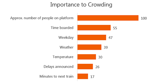
TreeNet scores are shown in comparison to each other. The most important input will always be 100, and every other independent variable is scaled relative to that top variable. So, as you see in Figure 1, the time I board the train and the day of the week are about half as important as the number of people on the platform when I board. That means that as it turns out, I probably can’t do all that much to affect my commute, but I can at least know when it’ll be particularly unpleasant.
What this importance chart doesn’t tell you is the relationship each item has to the dependent variable. For example, which weekdays have lower vs. higher crowding? Per-variable charts give us more information:
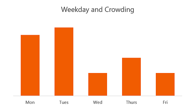
Figure 2 indicates that crowding lessens as the week goes on. Perhaps people are switching to ride-sharing services or working from home those days.
For continuous variables, like boarding time, we can explore the relationships through line charts:
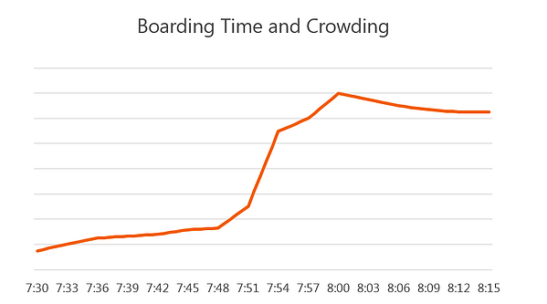
Looks like I should get up on the earlier side if I want to have the best commuting experience! Need to tackle a thornier issue than your morning commute? Our Advanced Analytics team is the best in the business—contact us and let’s talk about how we can help!